Thursday 29 January 2015

Some great collections

People ask me if I collect pens, and I tend to reply that they collect me. Or that I accumulate them. I have at last count about 800 pens, of varying qualities and prices, but I hesitate to call it 'a collection' when I look at the amazing hoards and, just as importantly, the in-depth knowledge that some real collectors have acquired.

So here are a few links to posts that show what a real collection looks like.

I think David Isaacson says he's a Parker collector, but he has a really amazing collection of Sheaffer Balances which he's posted up on Fountain Pen Board - carmines, roseglows, and ebonized pearl.  His posts show how he knows his stuff; what's in the catalogues, what's off-catalogue, versions that were only offered in Canada, variations of trim. My collection: "I want a Sheaffer Balance in each colour." A rather better collection: "I want a Sheaffer Balance oversize in each colour." A 'not completist but' collection - "I want a good variety of sizes and trims all in Roseglow". I don't think I will ever get to that third plane of existence!

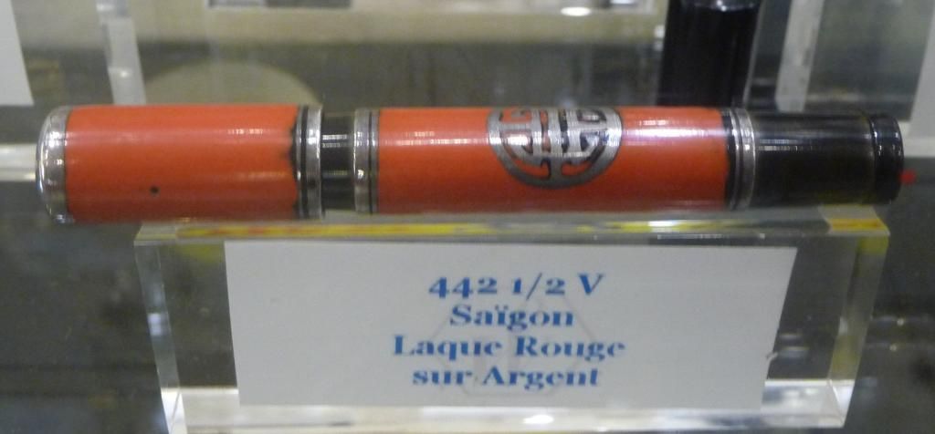
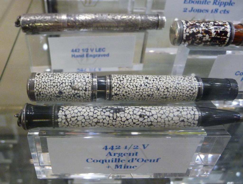
Lexaf is an expert on all kinds of fascinating German and Dutch pens. I'm very partial to a bit of nice celluloid and one of the fascinations is tracking down celluloids that were used by a number of different manufacturers, and sometimes, that helps us work out which manufacturers made which brands. He's done some fascinating detective work on a thread about 'no name' (or second/third tier) pens, illustrated with ridiculously beautiful photographs. (Thomas Neureither, 'Kaweco' on Fountain Pen Network, also displays an array of unbranded pens that is just wickedly lovely. He's a real expert on German pen history.)

The great thing about this kind of collecting is that you never know, when you pick up a pen at a sale or in an antique shop, what journey it might send you on. Maybe the clip is the same as another pen - then you have to decide, is it the original clip? or maybe a replacement? - or maybe the celluloid is the same, or the pen is exactly the same as another you've got, but the imprint is different. There will always be some detective work to do.

That's a very diverse collection of course. It is possible to concentrate a lot more.

Is it possible to make a collection out of a single pen? Yes.

Quite a few collectors have concentrated on the Parker 51, the Parker Vacumatic, or the Waterman Man 100, all of which have an impressive number of different colours, versions, special editions, sizes, and so on. But is it possible to make a collection out of the Lamy 2000 - any colour as long as it's black?

Well, yes, actually it is. For a start, because the pen has been made ever since 1966, it's been through a number of small design changes, including one of major historical importance - the change from 'W. Germany' to 'Germany' as the place of manufacture! - so there are different versions of the basic pen to collect. Then there are the special editions, the ballpoint and rollerball and pencils, and the special ballpoint editions.

I love this pen and I have three regular fountain pens and a few of the other versions, but the guy who really knows this one is Brandon Hollingshead. His impressive Lamy 2000 post is an absolutely crucial reference for Lamy lovers. I particularly like the fact that he has put time and effort into tracking down design references outside the fountain pen world.

I've found these collectors a real inspiration in my own learning about pens. These threads are all worth searching out, and if you're reading this and you're not already a member of FPN and Fountain Pen Board, you know what to do.

Friday 9 January 2015

My weapon of choice


Here is my weapon of choice.

It is not an AK47. It is not a weapon for a dictator or a terrorist to use. It will not kill or destroy.

In better hands than mine it will do things like this:


and this:


and this:

Collecting fountain pens. Collecting books. Loving gel pens, calligraphy, dip pens, watercolours. People think it's quaint, or crazy, or amusing.

But fundamentally, possessing a pen is possessing a weapon. A weapon of free speech.

I am armed. And I am Charlie.

Sunday 4 January 2015

Fountain pens - where to start?

One thing I've learned from hanging about on Fountain Pen Network and other forums is that people come into the world of fountain pens via all kinds of different routes. Some rediscover a once much loved pen - often a Waterman Laureat or a Pelikan school pen - and start enjoying writing with it so much they want more. Others inherit a lovely pen and want to restore it... and they get hooked. Others are already addicts to gel pens or calligraphy pens and then move on to the stronger hallucinatory drugs of urushi and maki-e...

So there is no one place to get started. And there is no one 'perfect' collection, though there are some truly eminent collections out there (and I'll do a post with some links later on this month, once I've restored a few new Merlins who have joined my collection).

Still, here are some suggestions for those getting into the world of fountain pens.

  • Cheap, easy 'learner' pens. You may outgrow these, but you can acquire them for pocket money. Jinhao, Duke and Wing Sung are good Chinese pens. They can be heavy, the lacquer finishes can flake off with time, and nib quality is patchy, so check up a good ebay seller on FPN. If you fancy acquiring some basic nibmeister skills they are a useful way to go. You might also consider Dollar pens, available on eBay - I have had good luck with mine.
  • Cheap, easy and reliable 'learner' pens. The Japanese are tremendously good at making good cheap pens - Pilot and Platinum both have cheap and commonly available pens, starting with the incredible bargain of the disposable Pilot v-Pen. I have about twenty and they all worked first time, really nicely - and if you want to, and are up to a bit of fiddly DIY, they can be refilled. I like the Waterman Kultur, still available for ten euros in French supermarkets, with its big steel nib and art deco looks, and the Pelikano junior. Only issue - many of these pens come in only fine or medium nibs.
  • Lamy Safari - a 'learner' pen that's also a collectible and a design classic. Because of the triangular grip section it's a bit of a love-it-hate-it pen, but it has the huge advantage of a very wide range of nibs that can be easily swapped, and which are cheap to buy separately. So if you are interested in calligraphy or want to try out broader nibs, this is a great route to take. Another cheapish pen with a wide range of nibs available, and because of its pocket size also a love-or-hate pen, is the Kaweco Sport - I have seven so in my case, it's love. In both cases, too, you can step up from the entry-level pens to mid-range pens in the same range and which use the same nibs (eg Lamy Al-Star, Kaweco Sport Classic, or Kaweco Sport Art - though the latter, sadly, is being discontinued).
  • Go the vintage route. All the modern cheaper pens have steel nibs. Take a risk on vintage and you can get a gold nibbed pen for very little. My favourite is the Parker 45 - a very common pen at flea markets as it was made for a long time and was a common school pen. It has a screw-in swappable nib, sometimes steel ('octanium' in Parker-speak) but just as often gold, and I have eleven for which I've never paid more than three quid each. The great advantage - they take standard cartridges or converter, and I've never had to do more than just soak them to remove dried ink and occasionally use a bit of micromesh to address some cosmetic issues. They are reliable, they write well, and they are very collectible, particularly the brighter colours (I'm on the lookout for Matador Red, Orange and Pink).
  • Another vintage pen that's fairly common and cheap and has super nibs is the rather small Parker Slimfold. No one seems to collect these, for some reason. Unless you have big hands, they are really lovely pens, with an aerometric squeeze filler that is usually in decent condition, so there's not much that can go wrong.
  • Not quite 'vintage' as it's 1980s, but often available second-hand for relatively little is the Waterman Laureat, a nice, heavy, generously sized pen with decent, reliable nibs and its own little fan club. (Waterman nibs for many of its pens are interchangeable, though they were not designed to be swappable, so this is a bit trickier than swapping Parker 45 or Lamy Safari nibs - none the less, it's something beginners can do without fear, so if you come across one with a broken nib, all is not lost.)
Or you can go my route. Which was, for about a year, to buy almost every darn fountain pen I saw at a car boot sale or in a junk shop. So during that year I managed to find, for less than five quid each, a First Year Parker 51, an early black hard rubber Onoto plunger filler, an Osmia Supra Minor, a couple of Parker Lucky Curve Duofolds and a Waterman 52. I also acquired a lot of Stypens, unbranded celluloid pens, Platignums and assorted rubbish, plus some pens I just don't like very much any more. I learned a lot, I got lucky a few times, and I have a repair backlog that's going to stop me being bored any time soon.

Saturday 3 January 2015

Waterman exhibition at Mora Stylos

Visiting Mora Stylos is always a fascinating trip: I've never seen such a massive stock of rarities and beautiful top-tier pens outside a pen show.

This autumn, the shop became even more interesting for pen collectors when it held an exhibition of Waterman pens and memorabilia. (I stupidly didn't take any pictures of the Waterman ink pots, model Waterman lorries and trucks, Waterman advertising, and other goodies on display, and have been regretting it ever since.) Monsieur Mora wrote the book on Waterman ("Waterman 125 ans d'expérience"), so there was a lot of knowledge and care going into the exhibition, and I wasn't disappointed.

I started with the display of early pens. Mainly for budgetary reasons, this isn't my particular interest, though I know enough that when a taper cap Waterman comes my way at a flea market for a few quid, I snap it up. And of course these early pens tend, many of them, to be a bit boring compared, say, to the many colours of the Man 100 - the severity of almost unalloyed black can be disconcerting - but this was quite a display. Once the red and the ripple came in, I was hooked.

There were a few pens that really caught my interest. There was the Waterman 20, in black. There was the Waterman 20, in red. And there was, great Scott! - the Waterman 20 in red ripple.That really is an amazing pen, striped like a tiger in the company of sleek black domestic cats.


Just for good measure there was the 'doll' pen (down in the bottom left corner of the photo).


There was a lovely display of different overlays.  (Confusingly, some of them seem to have different names in French from what we call them in English.) Some official Waterman overlays, and some ridiculously ornate, possibly Italian, overlays of crisp filigree and minute chasing. I particularly like the night-and-day overlay on red ripple - the gold and the red go so well together to create a luxurious and warm effect.

There were a few surprises. Emerald ray, for instance - I caught that out of the corner of my eye and said to myself "That'll be an Ink-Vue, then". No, it wasn't. It was a safety pen. Now to me, safeties are 1920s or before, and 'ray' celluloids are 1930s and later... but there was a marvellous anachronism with the same appeal as, say, a Brad Torelli agate acrylic Parker 51!


I'd never seen these finishes before, either - the Saigon pens, with an eastern design in red lacquer (there was another in green), and the honeycomb pattern in silver with black lacquer. That's one I would love to try recreating.


And eggshell, too. I know a few manufacturers today use eggshell mosaics as part of their urushi ranges, though abalone is much more common, but I never expected to see an early Waterman given such treatment. It is both intensely luxurious, and strangely chaste with its monochrome, matte finish.


Ripples were well represented, with a whole range of the different ripples: red, rose, olive, blue-green. I only have red, the most common, in my own collection. These were stunning, too - Waterman seems to have cornered the market in really strong, curved ripples, while other manufacturers had to make do with a vaguely marbled ebonite that doesn't have the directionality and drama of the Waterman pattern. I particularly like rose ripple, which is just made to have gold furniture - the gold complements the yellow and pink so well. (A conversation on FPN ascertained that MP Kandan of Ranga Pens is now producing rose ripple ebonite pens in India, so I could be adding one of those to my collection this year.)

And some more...

 After ebonite, of course, came celluloid. Easier to find, perhaps, but never easy to find in good colour - many of the colours, particularly the 'Persian', discolour easily. That's not an issue here! Not just one, but three colours of lizard - brown, green and grey - a stunning jade Lady Patricia (one of my favourite pens), and a bleu/creme pen that has such a clean contrast of white and blue it might almost have been a modern acrylic.


I wish there had been more Hundred Year Pens, a design I like very much - but then look at the one in the photo above. A really splendidly transparent green. My three don't look anything like that!

Moving on to modern times, Taperites and Crusaders were not much in evidence, but the CF was represented by a quite impressive collection of different gold and silver finishes. You often see quite acceptable CFs, but the finish on these was perfect, and it makes such a difference; pens absolutely scintillating, bursting with tiny glitters of light. I was most excited, though, to see a pair of CFs that might look to the uninitiated rather boring... one in silver trim, one in gold, a pair of CF demonstrators, in pristine condition.

Incidentally, the CF is a C/F for the American market and a CF in France.

Man 100 was the other pen to receive a whole case pretty much to itself, and this collection included quite a number of prototypes - some different woods, for instance. Again I'm kicking myself for not having taken more pictures - but I don't think pictures could really do justice to the sheer number of different pens, textures, and materials in that case.

Thanks very much Mora Stylos for such a superb exhibition!